Storysoft
Studio Editor
SAAS, PART OF A LARGER SUITE OF PRODUCTS
Storysoft's Studio Editor is a product designed for healthcare marketers to build, publish, and update Stories without the assistance of developers. Healthcare marketers are able to develop interactive Stories to use across social channels through an interface that allows users to use branded assets in a proprietary software tailored to the pharmaceutical industry. This product is considered the basic-plan for Storysoft Stories, providing customers with a cost-effective option.
Project Duration:
5 Weeks – December 2024
My Role:
Creative Direction, UI/UX, Prototyping
My Partners:
Notable Clients:
Amgen and Eli Lilly
"This [Studio Editor] is pretty intuitive. With the way it's designed, if I've never seen this before, I could still get a good result."
- Eli Lilly Team Member
the Problem and Ask
Healthcare marketers can't produce Stories on their own
So let's design an healthcare marketer-friendly interface that allows users to build Stories with little assistance
How might we…
Design an interface in which users can successfully build Stories with customizable, pre-built components?
Highlight features that allow Stories to meet pharmaceutical compliance requirements?
Create consistency throughout the Studio Editor interface as well as future products?
Primary Tasks
Develop a design system that will be used in the Studio Editor and further products within the larger Studio Suite.
Determine the level of complexity that is suitable for healthcare marketers and their agencies to use.
Incorporate pharmaceutical features such as Important Safety Information, Prescribing Information, and other pharmaceutical requirements.
Details
The Storysoft Studio Editor aimed to be a tool that could be sold as a cost-effective version to achieve Storysoft's primary product, Stories. The goal was to provide an interface that allowed clients to create their own Stories that adhere to global medical compliance standards, without having to involve our internal creative and development teams.
Starting off, there was a rudimentary version of the Studio Editor that hadn't been revisited since 2018. Knowing this, the team and I decided it would be best to nearly start over despite the product producing similar deliverables. This was decided because the original version was only used by internal team members, was difficult to navigate, and lacked many compliance necessities.
The new Studio Editor would need to make the process of building a Story more user-friendly. With this in mind, the plan was to create a list of typical Story features and reexamine how those are experienced from a healthcare marketer's perspective. As this standard Story feature list was finalized, compliance-meeting features were added to increase the Studio Editor's ease of use.
Another key point for the product was it's expandability. The pharmaceutical industry and regulations are constantly changing, so it's likely new compliance-meeting features would be needed in the future to keep up. This led to the decision to produce an easily expandable interface.
the Process - Step ONE
Defining key functionalities, a design system, & early concepts
Creating a foundation for the product's success
The Must-Haves
Details - The Design System
When going into the start of the developing the Studio Editor, I had the list of functions expected, a primary audience, and the request of a design system. This gave me a clear order of tasks, starting with developing a design system.
For the design system, the team and I decided it would be best to adopt an existing design system due to the push for a quick-turnaround. After some research, it was agreed that we would use Vuetify as our base. To customize this base, we implemented a theme sheet.
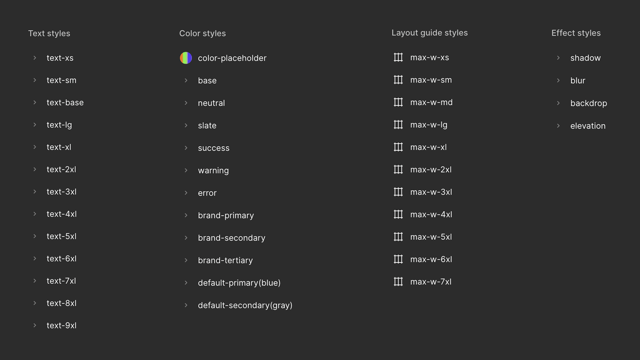
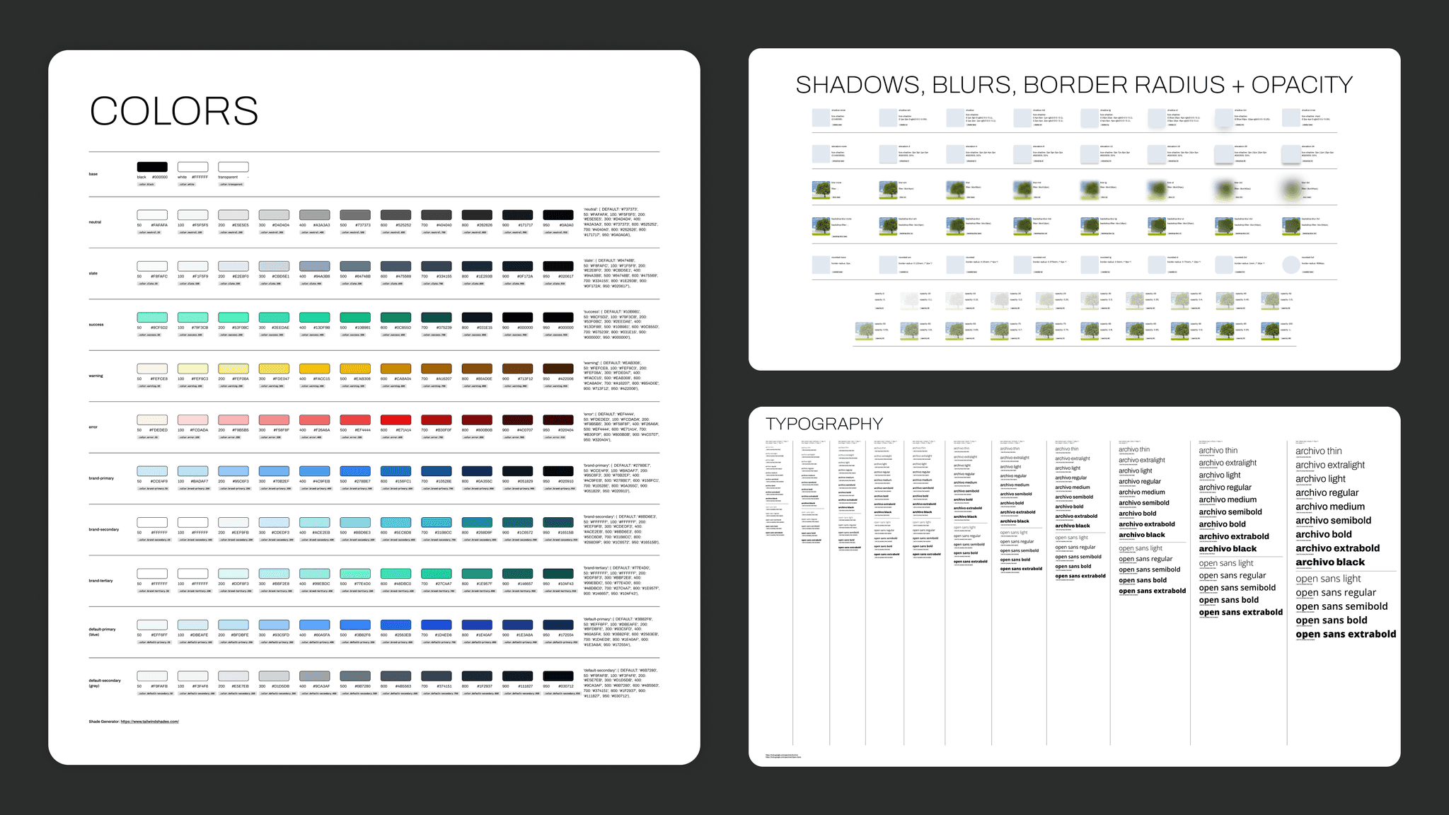
This theme sheet contained typography, colors, appearance variables, along with many other customizable details. To develop this theme sheet, I built out a Figma library filled with primitives and components that could be used to design a wide array of products. Here is where I made decisions such as adjusting our current branding for web to meet accessibility standards.
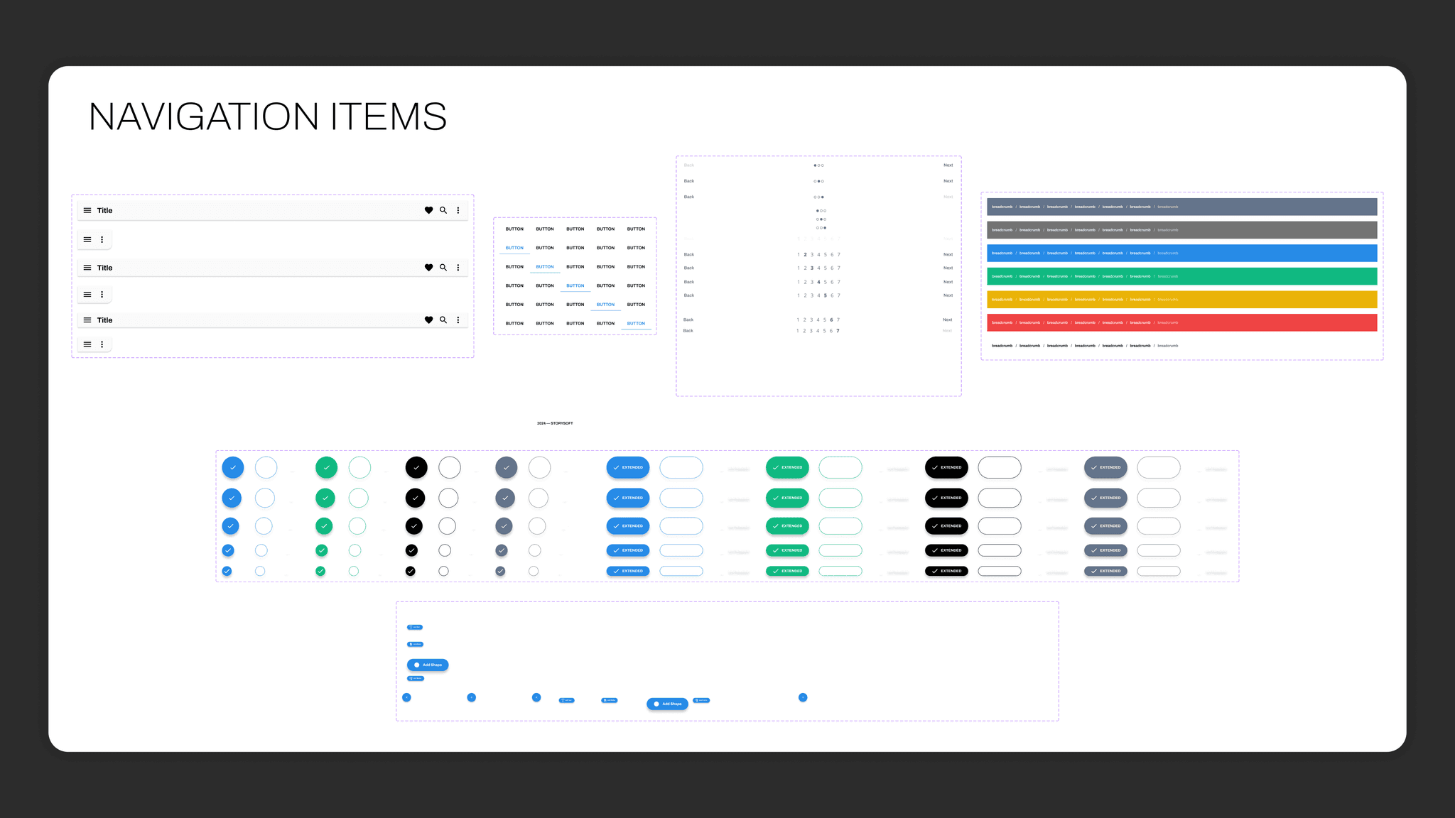
With primitives in place, I expanded the Figma library by building out initial base components from Vuetify using our defined styles. This was a time-consuming task, but one that was essential in moving forward in the design process. This design system was used to develop the initial concepts and eventually the current Studio Editor. The following images show the library of components and primitives that are now used across core products.
Details - key functionalities & Early Concepts
With the design system in place, my next task was to visualize the key functionalities and how they would all exist together. I took these functionalities and broke them into two groups: elements and menus. Anything that was in connection to an item that would appear in the final published Story was labeled as an element. The menus were classified by being a group of options relating to the backend of a Story.
Elements: text, image, video, background, button, animation, & code Menus: Story configuration, metadata, cloud management, & export
Diving deeper into the functionality of each element, I determined a set of global user controls. These controls include both positioning and appearance inputs. Element specific controls varied, but mostly revolved around the appearance of each item. This list of control requirements for each element allowed me to proceed into building out the first Studio Editor components.
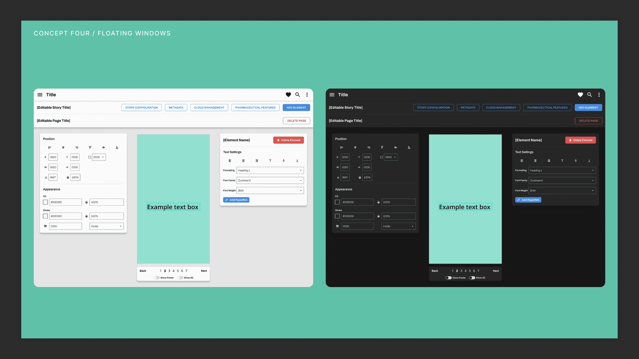
These components were used as my key pieces in designing the initial concepts for the Studio Editor. I explored multiple layouts that could present a simple user flow for primary tasks. I took the most refined concepts and created a presentation for my team members to review and comment on. Images of the initial concept presentation are shown below.
Design System

Initial Concepts

the Process - Step TWO
Designing the full product
Taking the design from an initial concept to a dev-ready prototype
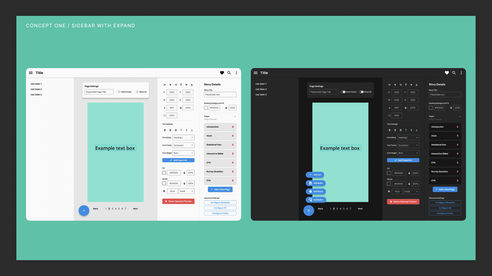
Deciding on a Concept + Early Conversations
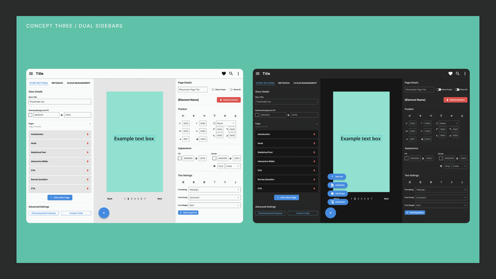
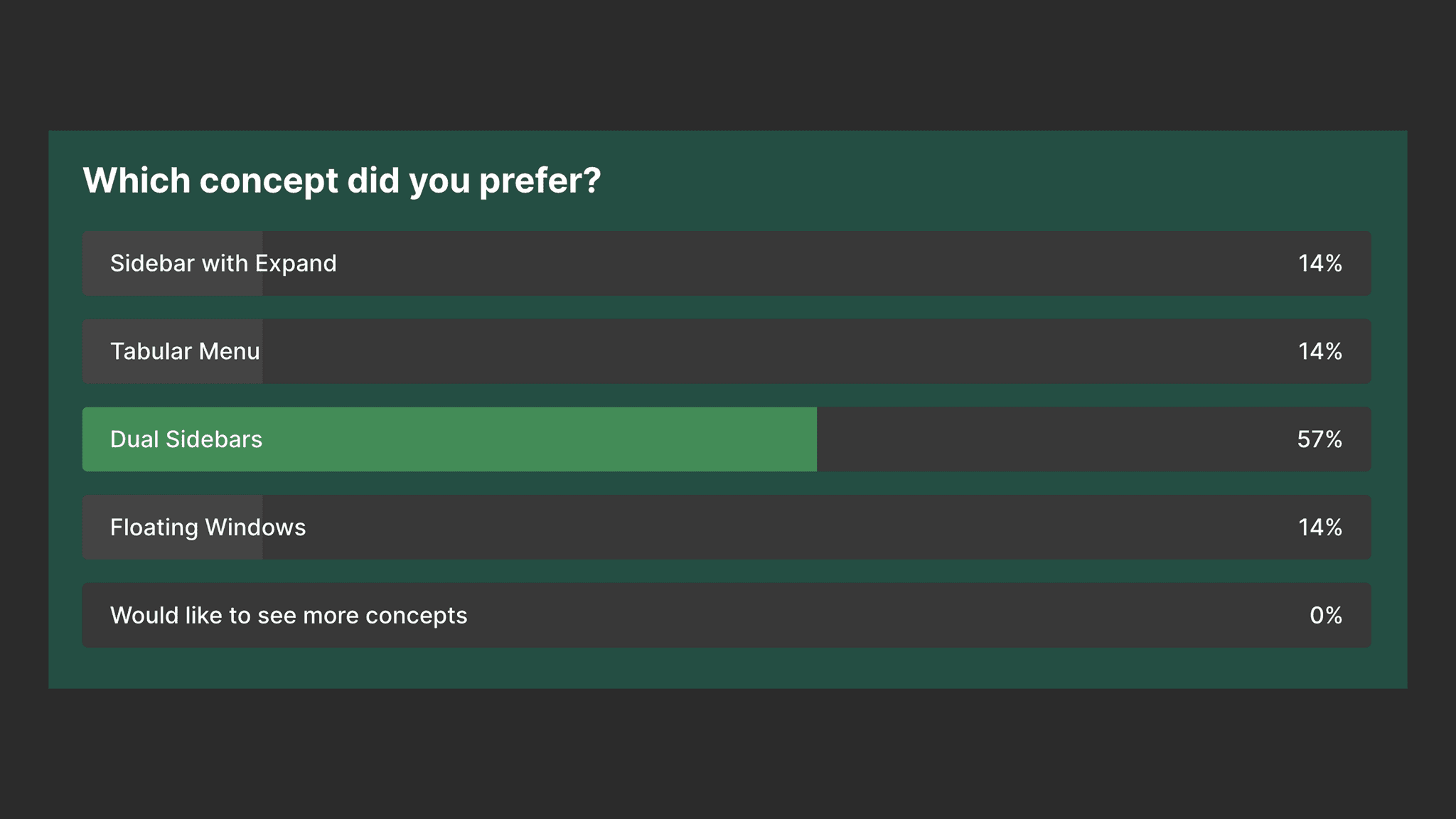
In terms of layout, the initial reaction from the team was to proceed with the dual sidebar design. Reasoning from the sales team was primarily about how this layout felt the most similar to products they had used before. This was also the layout preferred by our developers, due to a lack of programming concerns combined with a tight turnaround. From here, there were further discussions about categorizing which settings belonged with one another, the user flow for adding elements to the Story, and ranking the high-value actions that we had determined to be essential for the product and user.
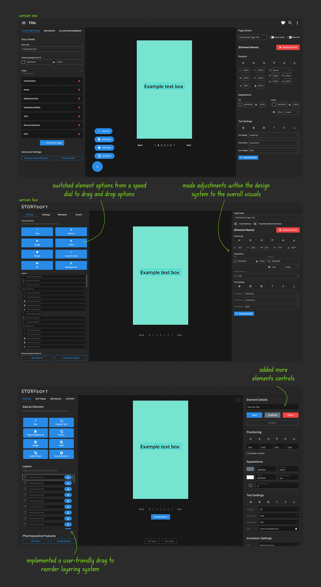
The request for drag & drop
Probably the largest change to the initial concept was changing the process of adding an element to the Story from a speed dial button to a set of drag and drop options. A primary goal was to have the Story elements options all visible within the default screen with the hope to have users utilize as many off-the shelf elements versus bringing in custom code.
The challenge here was to determine where we could fit this now much larger component within the layout. To do this, I reached out to the lead of the sales team and we went back and forth about what components needed to be in the default view and what could be tucked within a menu. It was a non-negotiable that the drag and drop options had to be the primary component due to that being a core user action.
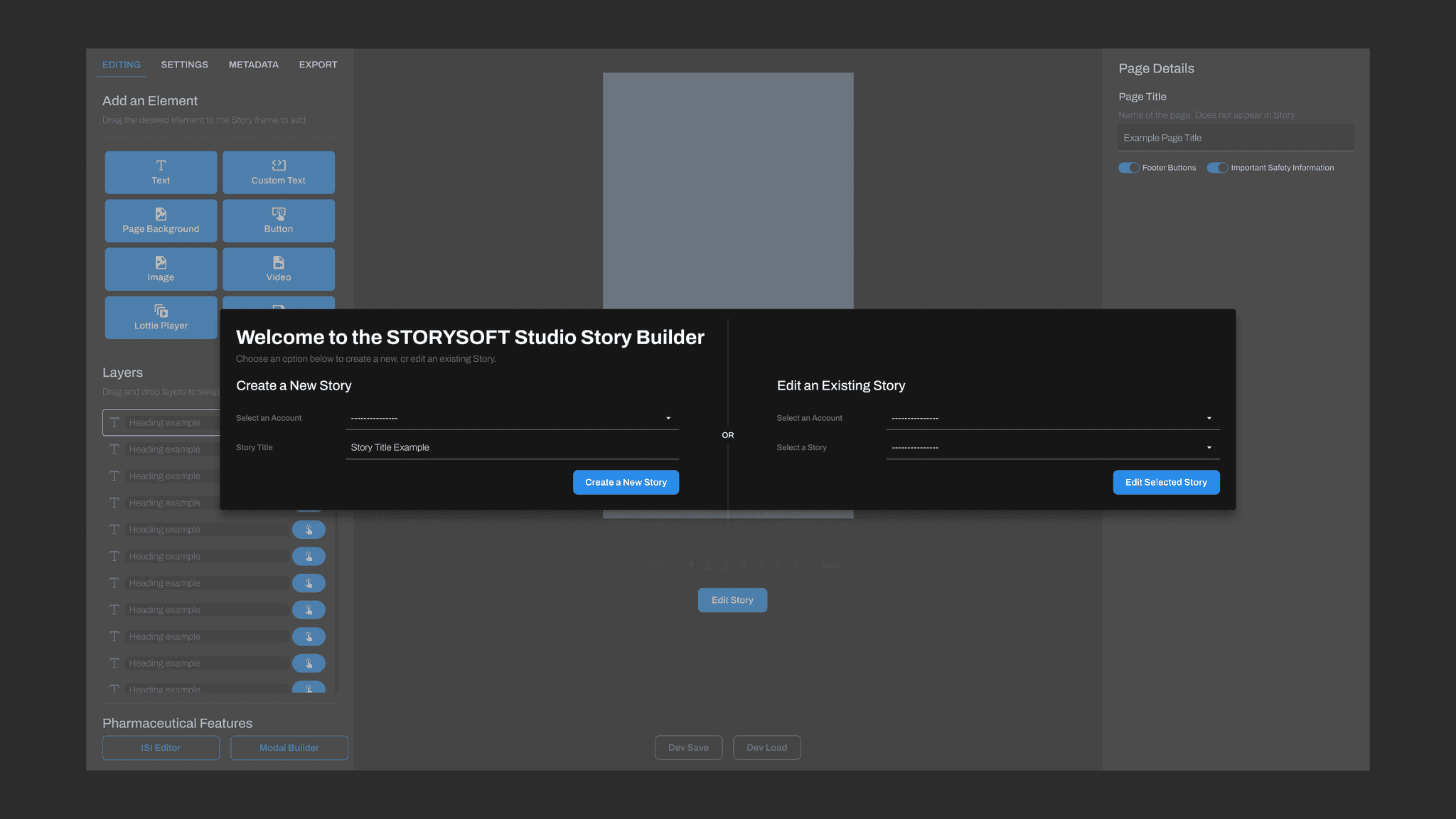
The solution was tied to the training that would take place with each client when they purchased a Studio Editor License. As part of the training, we could take a client through an order of operations that had them set up a few key settings prior to designing their Story.
At the start of the Story creation process, our clients do storyboarding and content planning. This happens mostly on their end with guidance from the Storysoft team. Knowing this, we observed that the number of pages within a Story would be a known number going into the Studio Editor. With this, I was able to move the section where the user could add and reorder pages to the "Configurations" menu. This worked well since the pages component and the new drag and drop options took up similar screen space and it allowed us to refine our training to guide a more user-friendly process.
Utilizing the design system
The design system allowed me to relatively quickly put together a prototype, receive feedback, and revisit different elements, all to be reviewed till approved. During this cycle of reviewing and updating, the individual components saw variations of style and interaction, while a few more components were created from scratch to fit within the interface. These established components allowed me to transition into creating the screens that would be passed off to the development team.
Creating Each Screen
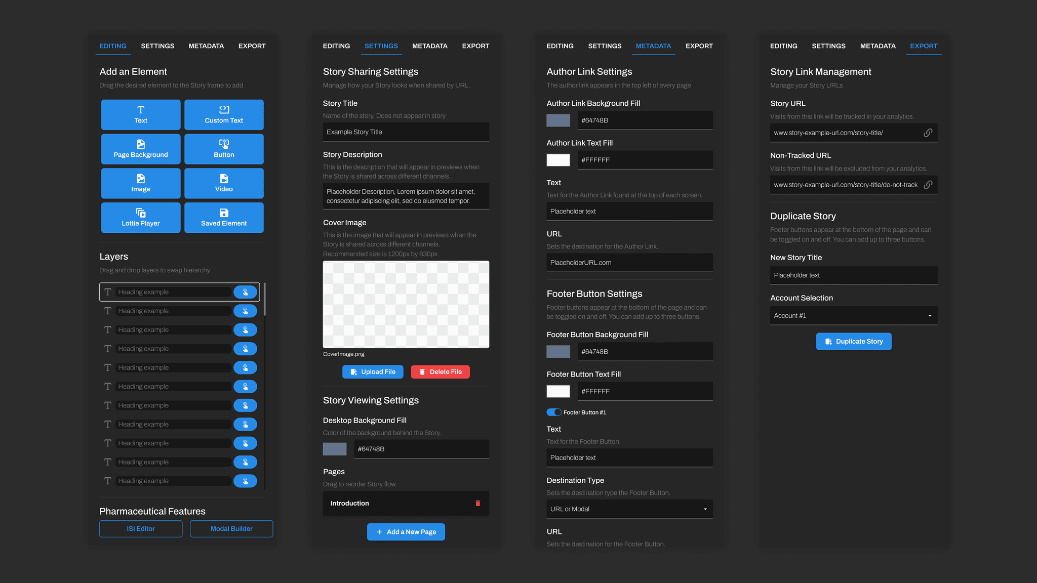
With feedback documented and new features requested and discussed, it was time to start creating each screen for the development team. Without listing every feature and input, below is a list of the primary screens / sections that need to be created for programming purposes.
Menus: editing, settings, metadata, + export
Left panel: action-tray, layering, pharma-actions
Center panel: story-frame, story-pagination
Right panel: global-controls, appearance, + details
Pop-ups: isi-builder, reference-modal-builder
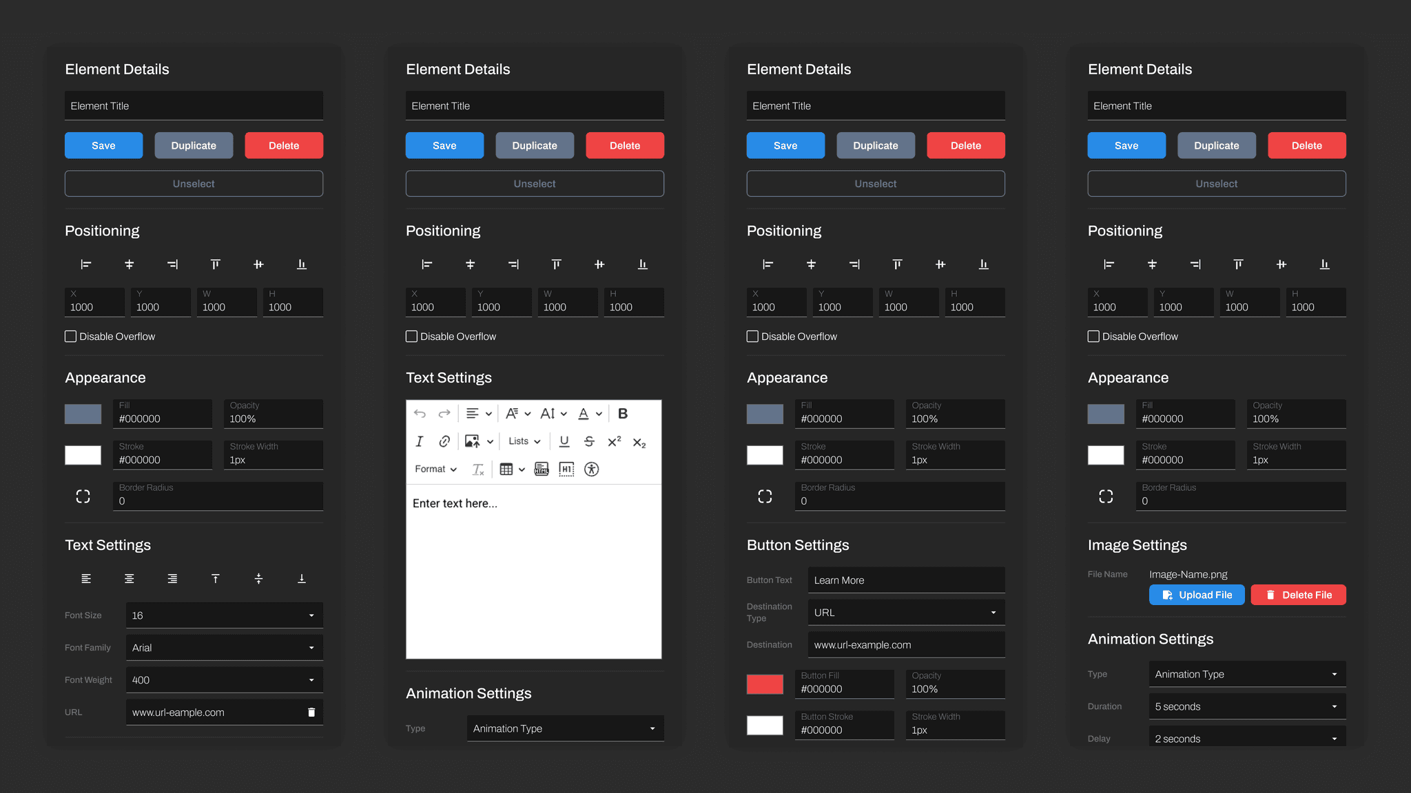
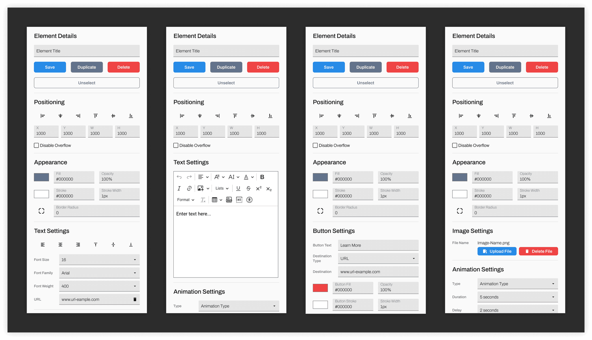
Element controls: background, text, button, image, video, + custom code
Once the layouts and components were approved, I began touching up the prototype by creating interactions and annotations for the Storysoft development team. The annotated design file, style guide, and component library were presented and handed off for development.
These screens were then programmed and reviewed by myself before going to our internal team. My role was to make sure that the programmed Studio Editor was aligned with the approved designs and expected functionality. After working side by side with our developers, we made some final tweaks before sending the draft link to the remaining internal teams. This is when I recieved what would be the last set of changes prior to launch. A few last minute ease-of-use features were added, but these were minor elements.
Below is an a series of screens to show how the Studio Editor evolved throughout this design process.
Evolution of The Studio Editor
Final Designs
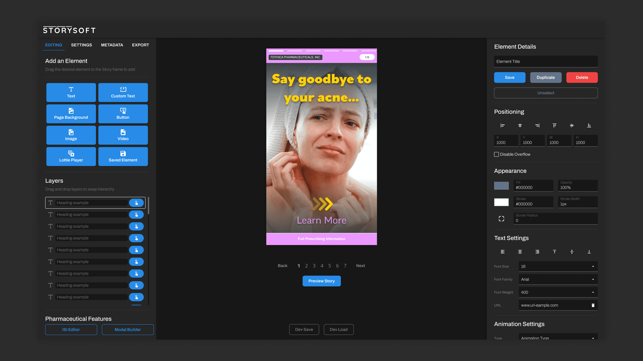
Introducing the Studio Editor
Below are images of the current Studio Editor as handed off the Storysoft development team.
Full Screens
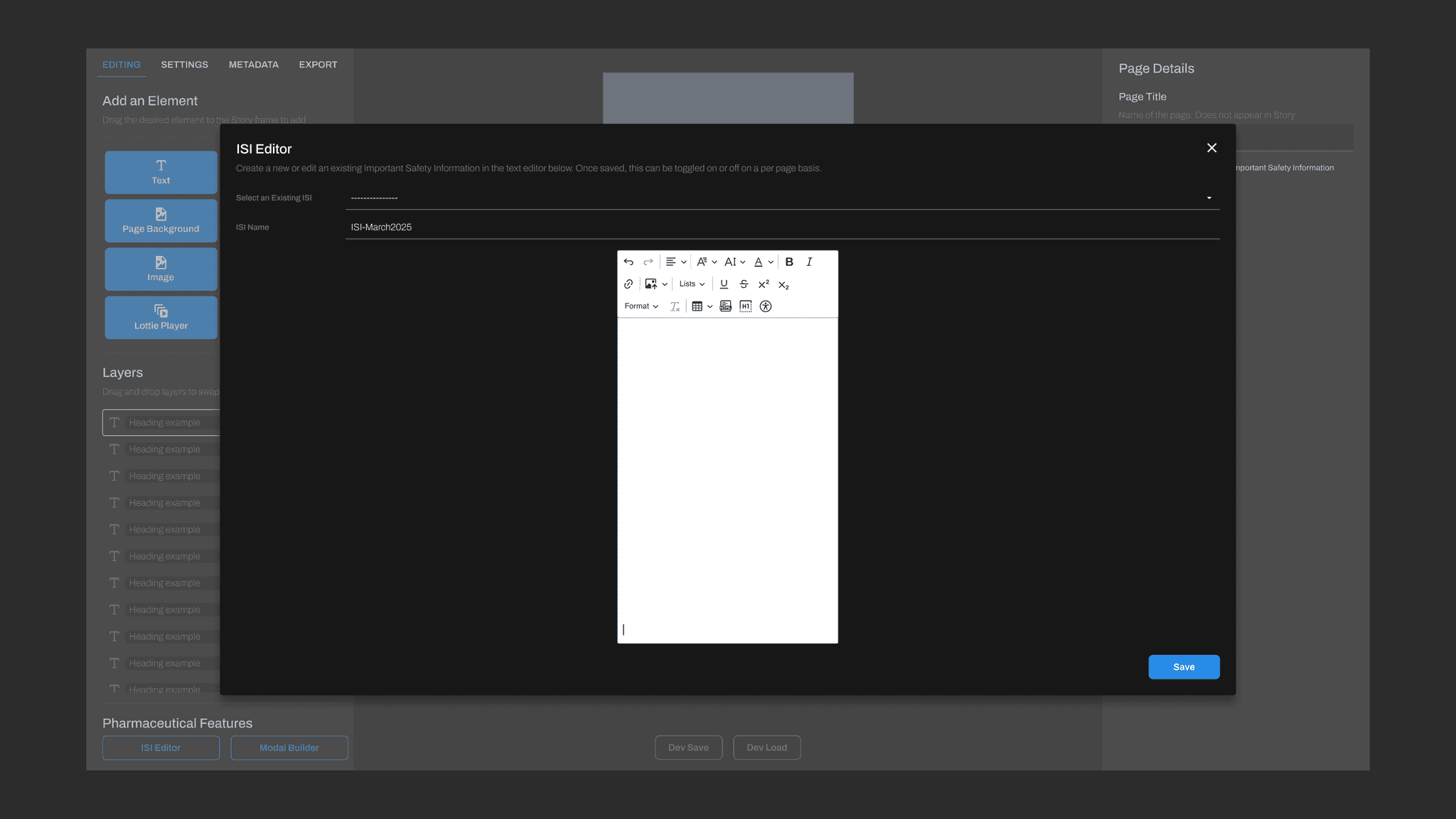
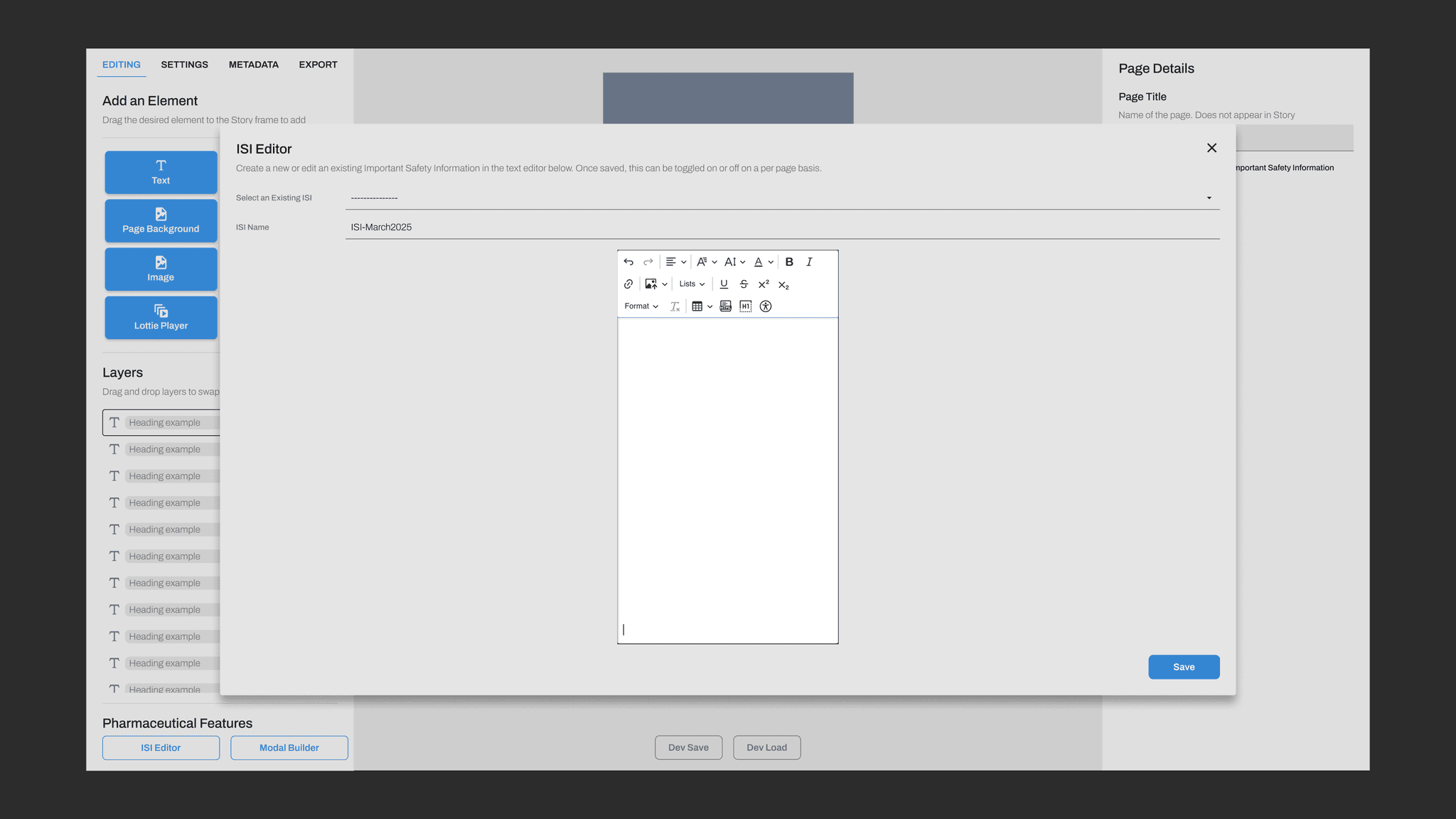
Menus

Element Controls
the outcome
Below are my thoughts and findings from this project
Looking back to reflect, learn, and improve
Details
Now that the Studio Editor has launched, I can look back and say I'm really proud of how this product turned out. As the lead designer on this project, I was able to learn quite a bit, especially through working alongside other departments.
Thus far, the Studio Editor has received positive reactions. In just a few months, the Studio Editor has increased revenue and client retention, all while positively reducing workloads for employees.
While this may be the first version of the Studio Editor, I am working adding new features based on feedback and observations in the first few client Stories.
This paired with the future goal of integration between the Studio Editor and our other core products, means I will be working on the Studio Editor for the foreseeable future. I look forward to maintaining and improving a product that has shown quick success with top pharmaceutical brands.